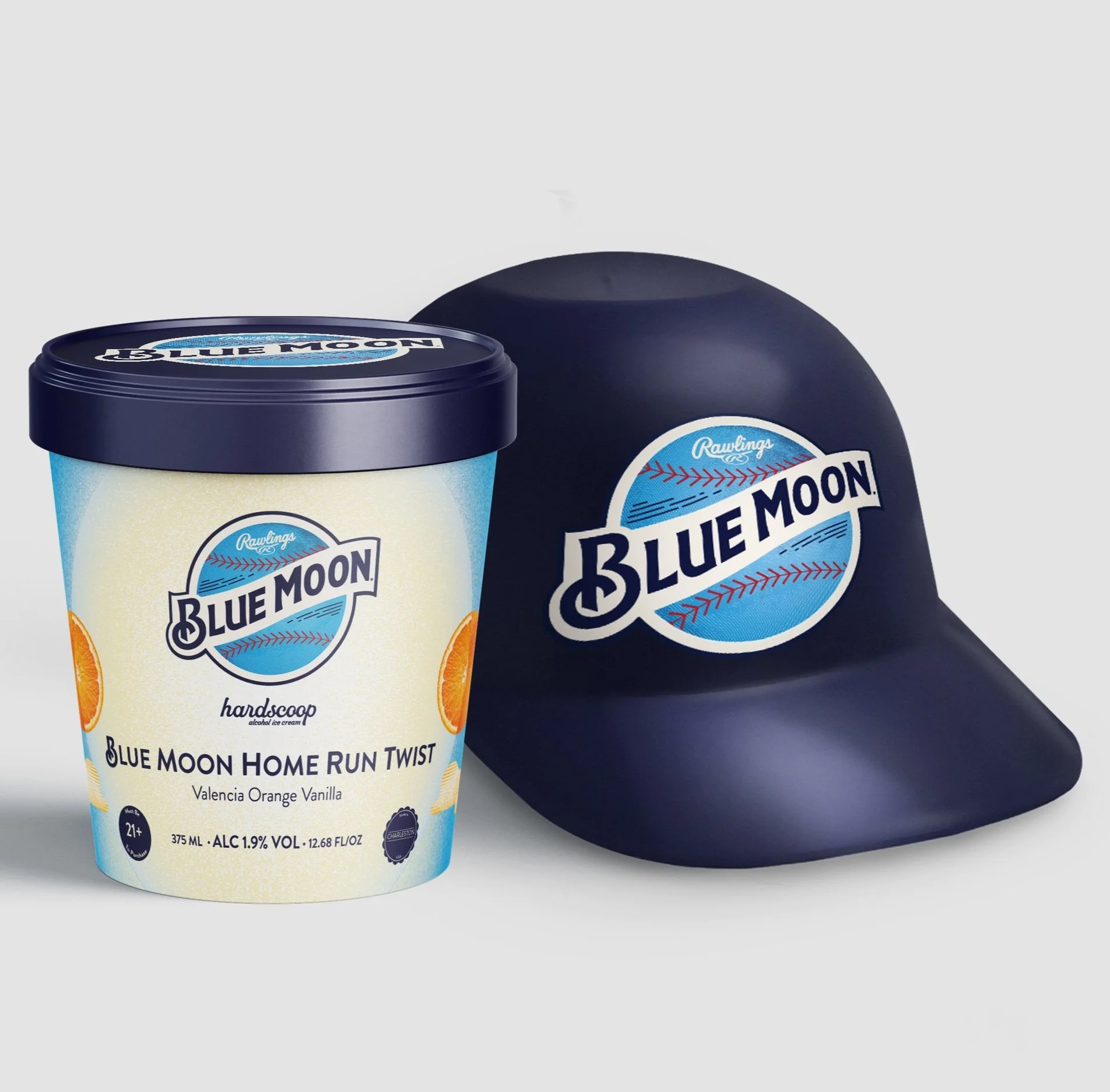
In 2024, I had the privilege of leading a groundbreaking project for Blue Moon. I was entrusted with the responsibility of creating the packaging, logo, and baseball equipment for the company, all while keeping in mind the distinct branding of three different entities. This was an ambitious task, but I rose to the challenge and delivered a unique and remarkable end product. The project marked a significant milestone in my career and demonstrated my ability to blend creativity, attention to detail, and strategic thinking to produce exceptional results, with a tight deadline.
-
Early Concepts
Our project began with a collaboration between us and Rawlings. Blue Moon, the brand we were working on, had its roots in a baseball stadium, so we thought Rawlings was the perfect brand to partner with. We created a logo that incorporated elements from both Blue Moon and Rawlings' vintage style, which perfectly complemented their apparel and baseball equipment line.
-
Rounds of Edits
Throughout the process of finalizing our collaboration, we encountered numerous challenges that had to be overcome. One of the biggest hurdles was finding a way to showcase both brand identities while still maintaining a cohesive overall vision. This required several rounds of revisions and careful consideration of each brand's unique qualities. Additionally, we had to manage tight timing constraints and ensure that all aspects of the collaboration remained within our budget limitations.
-
Final
After several iterations of revisions, we finally arrived at a consensus that the logo exhibited here was the perfect choice to proceed with as it seamlessly combined both brands into one. We ultimately decided to move forward with this option and obtained the approval of both brands, which was a great accomplishment.
First Label
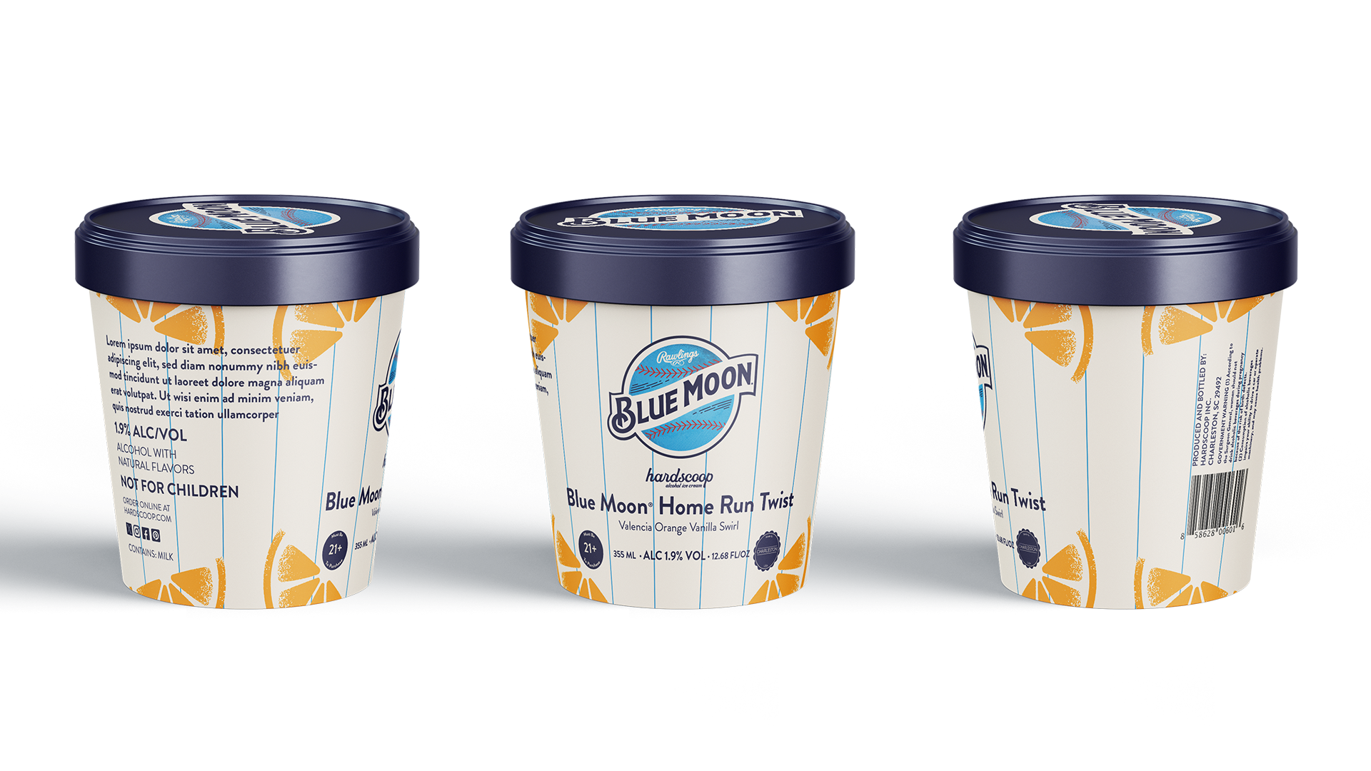
Upon the announcement of the collaboration between Blue Moon and Rawlings, Hardscoop eagerly sought to become a part of this exciting venture. Our initial prototype drew inspiration from the distinctive pinstripes found on the athletes' jerseys, symbolizing both tradition and athleticism.
To further encapsulate the essence of Blue Moon, we integrated subtle touches of orange throughout the design, reminiscent of the iconic orange peel garnish associated with the beer. This careful selection of colors and patterns not only honored the unique elements of both brands but also created a visually cohesive and appealing product that resonated with their shared audience.
Final Label
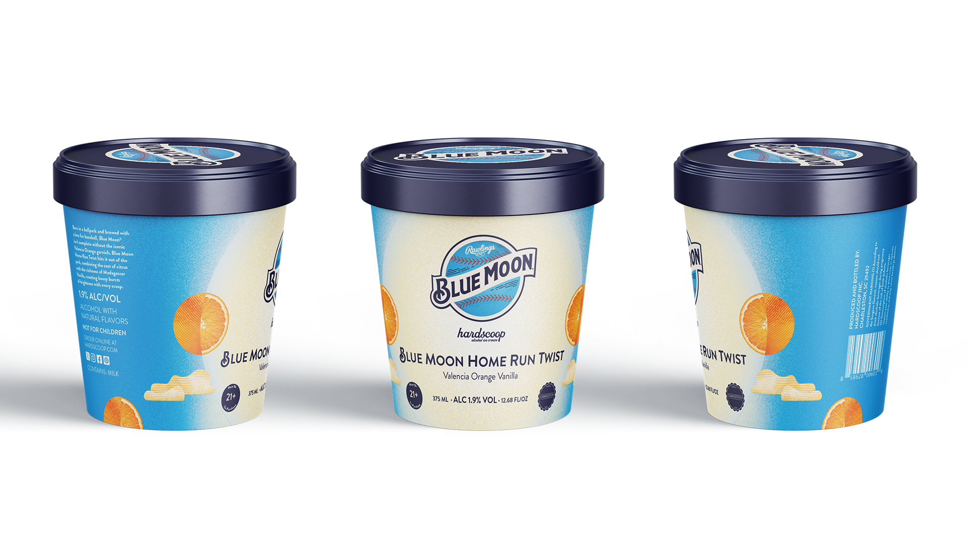
In the final packaging designs, we sought to pay homage to the moon’s unique shape by seamlessly integrating it into the label. We retained the iconic orange peels, enhancing them with a touch of flair to ensure they complemented the overall aesthetic. This was achieved by artfully blending the orange peels with cloud imagery, creating a harmonious and visually appealing design that reflects the brand’s identity and narrative.
One of the primary challenges we encountered was the incorporation of three distinct logos into the overall design. This proved to be a complex task, as we aimed to ensure that Blue Moon remained the focal point while still acknowledging our partnerships with both Rawlings and Hardscoop. Despite these challenges, we successfully navigated the intricacies of the design process, ultimately securing approval from all brands involved. This achievement positioned us well for a seamless and impactful launch in the summer.
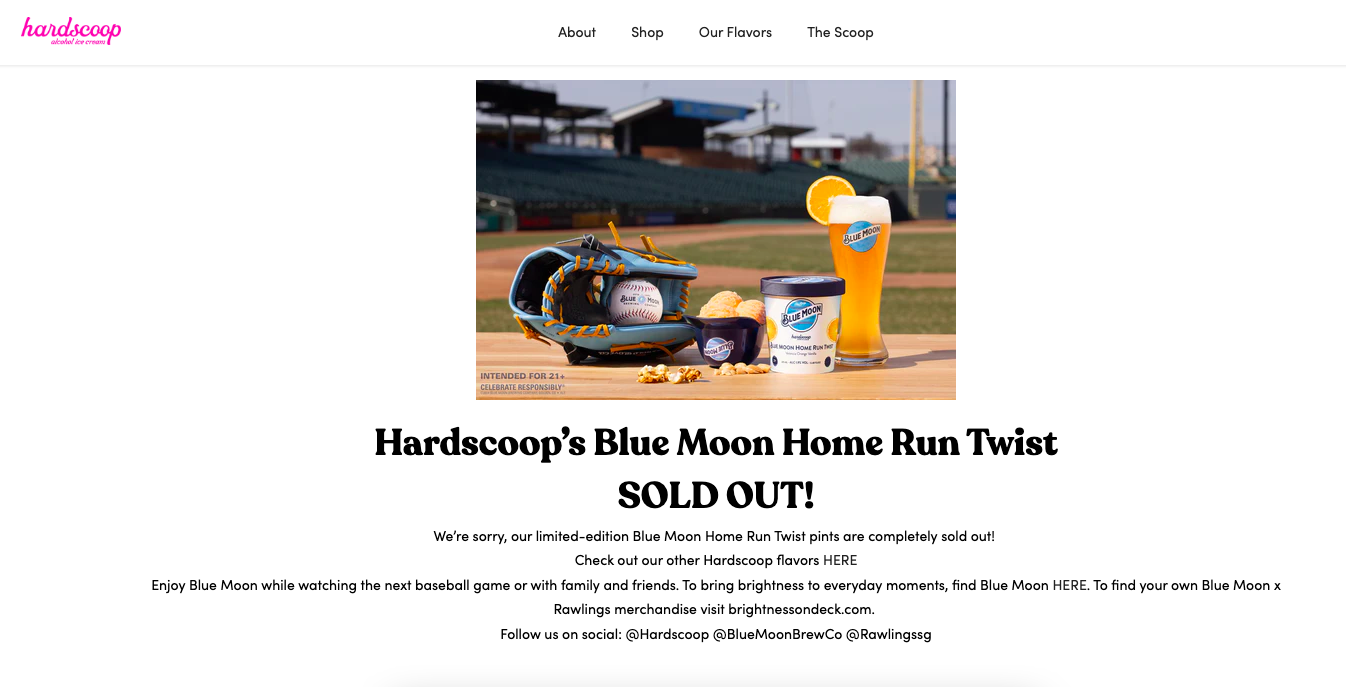
AFTER THE LAUNCH
AFTER THE LAUNCH
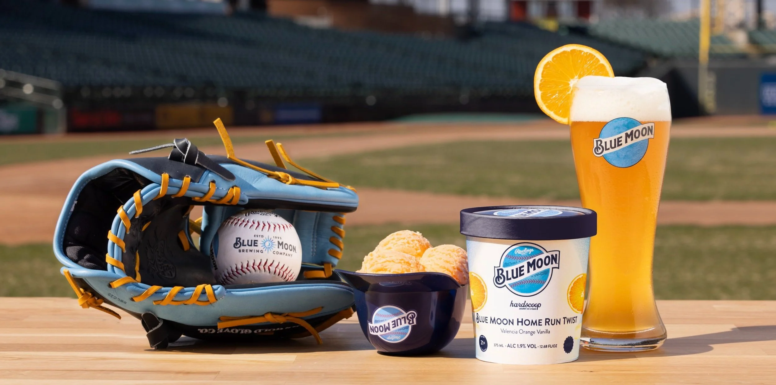
“Blue Moon Home Run Twist is a high-quality ice cream. The initial flavor profile is similar to orange sherbet, but it's definitely creamier. The orange flavor isn't overpowering or artificial tasting, and strong notes of vanilla keep things from getting overly fruity… Overall, this is an enjoyable experience not only for baseball fans but ice cream aficionados. Blue Moon Home Run Twist is proof that if you shoot for the moon, you might just knock it out of the park.”
- MASHED

